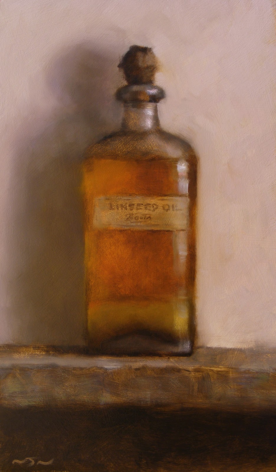
Friday, 20 November 2009

Satsuma II


Satsuma II - 6" x 8" - oil on panel

Thursday, 19 November 2009

All Star

Converse All Star - 10" x 12" - oil on panel

I liked the look of the old Converse from the compartments II painting so made a study of just the shoe itself.

Apple

Apple - 6" x 8" - oil on panel

As usual it’s been ages since my last post. A lot has been happening though, and I’ve been pretty busy with one thing and another. When I first started this blog I was mainly focused on portraits and figures and expected to continue down that road. I started painting small still lives mainly as practice and to work out ideas for backgrounds and interiors for portraits. Then I got kind of hooked on the still life work and now it has almost completely taken over everything I do. I ended up with quite a big and unexpected body of work and as a result (and after alot of thought about which is the best way to go with it at the moment) I have just signed a publishing and distribution deal with DeMontfort Fine Art. Although they want ALOT of work, and I was worried whether I’d be able to keep up with the demand, it has been a positive experience and has actually forced me to really improve my working methods – to focus and to work more quickly and much more efficiently. As a result I have probably produced more work in the last three months than I would normally have done in a whole year. I’m really hoping to find the time to do more portrait work over the next few months, but this is what has been taking up most of my time recently and I’ll start posting more work here soon.

Monday, 6 July 2009

Marmite, Ketchup, Mustard

Marmite - 20cm x 14cm - oil on panel


Ketchup - 20cm x 14cm - oil on panel


Mustard - 20cm x 14cm - oil on panel

This is a set of three paintings which were done recently as a commission. A while back I posted a small (but crude) painting of a Marmite jar, which was one of my first still life posts, so it was good to get the chance to have another go at it and I'm quite happy with result. I think the ketchup turned out pretty interesting too with the translucent effect of the ketchup on the sides of the bottle.


Thursday, 18 June 2009

Compartments III - Egg and Bottle


Another compartment painting. When I looked at the last compartment painting, I decided that the most effective section of the painting was the right hand side area with the shoe, the bottle and the lemon. In a way I thought that the painting could do without all the other elements, so I made a simplified, stripped down version of the composition. Slightly different but basically the same idea. Here is the result.

Monday, 8 June 2009

Flower

Flower - 5"x6" - oil on panel

Thursday, 4 June 2009

Pear

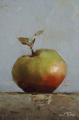
Pear - 5"x6" - oil on panel

I'm posting more small still life studies here. This and the work which follows won't have a BUY NOW button because I'm keeping most of it back for exhibitions, and some of them are already completed commissions. I am planning to put more work up on the blog for sale in the future though.

Tuesday, 2 June 2009

Mystery Portrait Postcards

Lucas Alexander


Self Portrait in a Convex Mirror


I was very happy to be asked by the National Portrait Gallery to contribute a couple of paintings to their Mystery Portrait Postcard exhibition for this years Portrait Gala. 139 portrait postcards were exhibited anonymously and sold to guests on the night of the Portrait Gala, which raises money for various educational programs at the gallery and also to help them purchase important new works for the collection.
Because my invite was sent to my old address, I didn't even know that I'd been asked to do it until about a week before the exhibition! So without too much time to think about it, on the two postcards which they sent me I made a small drawing of my son Lucas on one, and a pretty loose self portrait on the other. The self portrait sold on the night, but as far as I know the drawing of Lucas is one of a handful of paintings still available to buy on the NPG website. You can see all the paintings from the exhibition here or even buy my drawing if you fancy, here.

Monday, 25 May 2009

Compartments II

I was never too happy with the last compartment painting, which was the last post I made. I thought there was something about the label on the bottle which didn't work and the whole thing looked a bit too much like an underpainting, so I decided to do some more work on it. I took out the label, half filled the bottle with grapeseed oil - which I think draws together the greens and yellows more, and repainted most of the background. I think it has a lot more depth to it now.

Back again.

I know I haven't posted anything for months and months. With moving house last year, computer problems, internet problems, camera problems and every other type of problem, the blog got a bit neglected, but I'm back onto it now. Thanks for all your comments since the last post and thanks for still looking.

Thursday, 4 September 2008

Compartments II - Bottle and Blue Surform


This might be the last post for a while. Still busy moving house and it needs alot of work, so everything is on hold at the minute.
Another compartment painting. The blue object is an old surform (a kind of wood plane). I had been hoping to find an old retro style stapler for this painting, but didn't come across one. I found the surform and thought it had a bit of character. I realised that it had a similar shape to what I was looking for in the stapler, so went for that instead. The shape kind of echoes the shape of the shoe and the colour pulls the blue out from the AllStar logo. Although the objects in the paintings may appear to be random, or "mismatched", they all associate with each other in some way. One of the ideas behind these paintings is "balance" so I'm trying to get a relationship going between the colours and the shapes - where a certain shape or colour is repeated or mirrored elsewhere in the painting- tying the compsition together.
I'll post some closeup details of this painting in the next post.

Friday, 22 August 2008

Untitled - Charcoal

More charcoal work.


Haven't had much of a chance to get stuck into these charcoal drawings yet. They're still kind of in the experimental stage. Busy moving house at the minute so I'm not getting much work done.

It's easy to go too dark with charcoal and once it's down it's difficult to take off again. Finding the right paper is one of the main problems. I've tried alot of different "speciality" paper recently, (and wasted alot of money) , and I've ended up coming back to plain old Canford cartridge paper. It's the only thing I've found which will respond to each of the tools I'm using, (pounce bag , stumps, charcoal sticks etc.), and give any kind of control over the surface texture. It's still not quite there though. I would like to find something more archival, and with more of a velvety surface - something that will take alot of the rough texture of the chracoal sticks and also the softer work with the brush. I've heard that some of the Strathmore paper is good for this kind of thing, but it seems hard to get hold of in the uk, especially in the bigger sizes.

Wednesday, 11 June 2008

Charcoal - Head of a Man

Head of a Man - 32" x 45" - charcoal on paper


For a while now I've been intending to start a series of drawings in charcoal. Up until now I haven't had a chance to really get started on them, but I've had an image in my mind of how I want these drawings to look. The idea was to keep them quite loose and almost "painterly", but with focused areas of tighter detail. I knew that I wouldn't be able to get the effect I was after just using straightforward vine or compressed charcoal on it's own so after a bit of experimenting, I've found that a combination of brushes, stumps, pounce bag, pencils, powdered and compressed charcoal gets pretty close to the idea I was trying to get at. I'm still looking for a way to "paint" with powdered charoal. I think spraying it with something and spreading it with a brush is the way to do it, but I need to work out what to use, possibly some kind of alcohol. I'll post more of these as they come.


Wednesday, 4 June 2008

Still Life with Pot and Matches


Still Life with Pot and Matches - 18" x 14" - oil on panel

This is the first in a new series of larger scale still life paintings. The wooden compartments will be a recurring theme, so I'll see where they take me.

Stillness and Meditation

“Seek in a still life stillness and meditation. You may find there action, drama and passion, but the best still life is that wherein inward calm is attained in quietness.” - Albert Plasschaert, Dutch art critic.

Sunday, 30 March 2008

Eilidh (La Luna)

So, as promised, here is the original portrait of Eilidh.

Eilidh (La Luna) - 40" x 30" - oil on canvas

The object she is holding is a tarot card, "The Moon" or "La Luna", from an old Italian deck. It is a play on the name "Eilidh" - a Gaelic form of Helen, which means "moon" or "shining light". I had originally intended to have a window in the room with moonlight coming in, but in the end decided to keep things simple. The moon idea is echoed in the round pendant she is wearing and also, to some degree, in the overall roundness of the shape created by the face and hair.

Here are some closeups of various details:


And the original oil sketch which the painting was based on...

Wednesday, 26 March 2008

Original painting of Eilidh

In an earlier post I put up some pictures of the different stages of the painting “Eilidh in Northwest Light”. I mentioned about how I had originally started the painting as a much larger piece, but came to a standstill half way through and painted the smaller head study instead. It had always been at the back of my mind to carry on and finish the first painting but I hadn’t really planned to do it any time soon.
For the last couple of months, since around Christmas, I have been working on paintings for the various London portrait exhibitions, which creep up all at once around this time of year. As usual, I had started something way too ambitious, way too late to have anything finished in time, so after a bit of a panic, I came across the original, half finished Eilidh painting - which I had forgotten about - and decided I could do something with it. I left the painting I was working on (again) and started work on this instead.
It’s always surprising what six months, or even a year of not looking at a painting can do to your perception of it. Looking at something with a “fresh eye” is one thing, but looking at something which you’ve completely forgotten about pretty much makes it like a brand new painting again. I could see it had potential and I knew exactly what I needed to do as soon as I saw it, so got to work straight away. I think that it’s reassuring , and a good measure of advancement, when you can actually pinpoint the exact thing which was causing the problem, and which actually stopped you finishing a painting, and a few months later go back and understand it, paint it, and move past it.
The main issue here was that I had brought the face up to a certain level of finish ,or so I thought, but it still didn’t look finished. It didn’t look particularly like it was existing in three dimensions. It didn’t look convincing. It’s not that it was flat, it just looked “unreal”. And in trying to inject realism into it (but without understanding what it was really lacking), I ended up “overpainting” it, and managed to paint out any kind of expression that had been there. A lot of the problems were solved by a better understanding of colour mixing, more meaningful application of the paint, better drawing and in this case closer attention to the structure of the eyes. And because most of the groundwork was already done, it took a lot less time to inject some life back into it than I had expected.
I managed to finish it just in time, and went about as far as I could go with it. I’ll sort through the photos and put up the pictures in the next post.

Sunday, 16 March 2008

Pot and Plum


Pot and Plum - 5"x6" - oil on panel

SOLD

Monday, 10 March 2008

Duncan Leitch Torrance


This was painted a while back. Portrait of author Duncan L Torrance, for his forthcoming book,  "Desert to Danube".

Saturday, 8 March 2008

Still Life Painting - Lemon


Lemon - 5"x6" - oil on panel

SOLD

Thursday, 14 February 2008

Plum #1


Plum #1 - 4" x 5" - oil on panel

SOLD

Still Life Paintings

Unfortunately I haven't been able to paint and post as many of the small still life paintings as I'd hoped because for the last two months all of my time has been taken up with portraits for upcoming exhibitions, which I will post in the next week or so. Towards the end of this month I'll hopefully be able to get up to speed with these and start posting more regularly. So far I've really enjoyed doing them and I can see that I could really benefit from the discipline, so I'll look forward to getting into the habit of doing them more regularly.

Wednesday, 6 February 2008

Still Life painting #3 - Linseed Oil


This ancient bottle of linseed oil - covered in dust and full of sediment- has been sitting in the same place on a shelf in my grandfathers old garage for at least fifty years, so I thought it was about time to paint it.

Linseed Oil - 5" x 6" - oil on panel

£50 (price includes shipping).


Realism and Expression

Something I have been becoming more and more concerned with recently in my painting is trying not to "over paint " a subject - to leave alone what doesn’t need to be touched. Some marks that are made on the canvas are inspired and happen just as they should, but unfortunately they aren’t always recognised for what they are and are obliterated and overpainted in the pursuit of a more “accurate” painting. The magic that can be created by two or three intelligently placed or inspired brushstrokes can be snuffed out by one thoughtless or meaningless one, and the effect lost completely. The question is; at which point do you sacrifice the absolute accuracy of the object you are painting for the artistic and creative or emotional expression of the object in paint? This is the personal dilemma. On more than one occasion I have looked at photographs I’ve taken of a painting in progress, and discovered that, in some ways, the underpainting or early blocking in stages are actually more expressive of , and true to, the character of the subject than the finished piece. Sometimes, in the pursuit of realism, some of the expressive magic is lost. I think that the struggle to find a balance between creative and emotional expression, and realistic accuracy is something that a lot of artists can possibly relate to. There needs to be a certain amount of “play” between realism and the artistic vision.
In his book “The Practice and Science of Drawing”, published in 1917, Harold Speed calls this principle “dither”. He talks about the problems of a very accurate Academic style of drawing versus a less rigid, expressive approach. He says :

“It is difficult to explain what is wrong with an academic drawing, and what is the difference between it and a fine drawing. But perhaps this difference can be brought home a little more clearly if you will pardon a rather fanciful simile. I am told that if you construct a perfectly fitted engine - the piston fitting the cylinder with absolute accuracy and the axles their sockets with no space between, etc.- it will not work, but be a lifeless mass of iron. There must be enough play between the vital parts to allow of some movement; "dither" is, I believe, the Scotch word for it. The piston must be allowed some play in the opening of the cylinder through which it passes, or it will not be able to move and show any life. And the axles of the wheels in their sockets, and, in fact, all parts of the machine where life and movement are to occur, must have this play, this "dither." It has always seemed to me that the accurately fitting engine was like a good academic drawing, in a way a perfect piece of workmanship, but lifeless. Imperfectly perfect, because there was no room left for the play of life. And to carry the simile further, if you allow too great a play between the parts, so that they fit one over the other too loosely, the engine will lose power and become a poor rickety thing. There must be the smallest amount of play that will allow of its working. And the more perfectly made the engine, the less will the amount of this "dither" be.
The word "dither" will be a useful name to give that elusive quality, that play on mechanical accuracy, existing in all vital art.” -
Harold Speed - “The Practice and Science of Drawing”.

Tuesday, 22 January 2008

Still Life painting #2 - Marmite #1


Marmite #1 - 5"x6" - oil on panel .
SOLD

Wednesday, 16 January 2008

First still life post - Satsuma


As promised, heres my first small still life. I painted this orange three times before I managed to do it some kind of justice! Hopefully it will be the first of many.

Satsuma - 5"x6" - oil on panel.
SOLD


Wednesday, 9 January 2008

Small still life paintings

Not Quite "Daily Paintings"

To get back into things after the Christmas break and get back into my stride in the studio I have decided to do a series of small still life paintings. In a “daily painting” style (but probably not on a daily basis), I will paint an object which I find close by, at home or in the studio, on a small scale, and within a limited time frame (1 - 2 hours perhaps?). This will give me the opportunity to make finished paintings in one session and, because of the small scale and limited time, it will really force me to simplify and hopefully paint more freely than I’m used to doing.
I’ll see where I go with these - when I have a few together I may turn them into an exhibition in a gallery or I might just keep it as an online based thing, but for the moment they will be for sale on my blog. I’ll probably set up an eBay based system for selling them at some point soon, but for the time being, if you are interested in purchasing them, just send me an email at NewNorthArt@aol.com or click on the link beside the painting and I’ll get straight back to you. Be sure to check back for the first painting.

Wednesday, 5 December 2007

Eilidh - The finished painting


So here is the finished painting - Eilidh in Northwest Light.  Oil on canvas - 16" x 12".

Eilidh head sketch


I got a little bit sidetracked and made a quick sketch of the head from a different angle, and was struck by the simplicity of this pose and in particular the arch of the neck. So I abandoned the original idea and immediately started to make a new painting of just the head and shoulders. My main focus was on the shape made by the neck and the direction of the eyes.

Portrait of Eilidh


I don’t have any progress shots for this next painting but I do have a couple of the stages and ideas I went through before it turned into the finished painting.
I had originally intended this to be a large portrait - almost full figure, set within a darkened room. Here is a small basic oil sketch of the general idea. Following this idea, I had started work on the main painting, but about two weeks in came to a standstill, got frustrated and started doodling some different ideas.

Back Again

Haven't been able to post anything for a while because as soon as I got the blog going my internet packed up! I'm back now and will post something shortly.

Thursday, 15 November 2007

Georgia - the finished painting


And the finished painting.
Georgia - oil on canvas 9"x 12"

Intermediate stages


At this point I stopped taking pictures and got lost in the painting process, but here are a couple of intermediate photos. Sorry for the poor image quality, I've tried to sharpen them up - when I took these photos, I hadn't intended for anyone to see them.

The main problem that dominated this painting was the eyes. I worked for a LONG time trying to get the eyes to "sit into" the head, and to bring some kind of form to them rather than just have them appear as a flat plane. Each painting I do seems to present some kind of "eye challenge", and I think some closer study of the structure of the eye
might be needed in the future. I changed the clothing at this point too. I felt that the contrast of the bright pink top made the whole painting more "punchy" and somehow more solid.

Saturday, 10 November 2007

Stage Four - Underpainting


After loosely blocking in the large masses of light, and once the whole canvas is covered, I've arrived at something vaguely resembling an underpainting. At this point I just let the whole thing dry before beginning the overpainting.

Stage Three


Blocking in the main large masses of the face, with the help of a smaller,very basic oil study,which is really just indicating the position of the light and dark masses. I'm trying to keep it loose at this stage, as I don't want the painting to become static. Nothing is definite at this stage, the painting moves with the model.

Tuesday, 6 November 2007

Stage Two


Blocking in the hair. The important thing in the beginning is just to get some paint onto the canvas. I usually start by blocking in the dark tones in the hair, ignoring detail and looking for the underlying structure.

Sunday, 4 November 2007

Stage One


Stage one of the painting. Basic line block in. General guidelines to get the painting started.

First Post - Portrait of Georgia


So here's my first post - a portrait of my soon-to-be stepdaughter Georgia, oil on canvas. This was the first piece of work I did after returning from my time spent in France as a student at Studio Escalier. This painting was exhibited at this years Royal Society of Portrait Painters exhibition in London. Next I'll post some progress shots of this painting from start to finish.

 
British Blog Directory